Wednesday, August 8, 2012
It’s August. And hot…
I am listless and it is just too hot to paint in my little art studio. It is the warmest room in my house as it’s situated over the garage which has a metal garage door that gets beaten with direct sunshine in the afternoon. So I am taking a little break. And hoping it will cool down soon!
Wednesday, August 1, 2012
…and one last sale from the Artful Home!
This one snuck in under the wire! A work on paper from 2006, this piece was painted as part of an experiment that explored this particular color palette along with the abstract concepts in what I refer to informally as the “Jumble” series. This was the nicest of the explorations. I had never attempted to sell it previously to the Studio Sale. So when I was looking through all of my works on paper, this one struck me as being a caliber worthy of the Artful Home, sale or no sale. So up it went! And someone bought it! In a few days it will start its journey to New York.
 |
| Close Quarters, 2006 Acrylic on paper |
Tuesday, July 31, 2012
Another Sold from the Studio Sale!
I am very excited that someone has purchased one of my figurative pieces! I painted this one in that flurry of figurative paintings I had an urge to do a couple of months ago. I enjoy painting figures, or really, faces, but I always feel unsure about how the rest of the world will receive them. Even though I cannot say how many times in the past few months that people have commented that they love my figurative work, I still feel unsure. So, now someone has actually purchased one and this makes me very happy. And inspired to do more. Anyway, this painting will soon be on her way to Georgia.
 |
| A Day for a Hat 10" x 20" Acrylic on canvas board, 2012 |
Monday, July 30, 2012
Sold from the Artful Home’s Studio Sale!
Industria #11 is one in a series of paintings I did for my very first art exhibit in 2005 at Remmi Fine Art in Denver, Colorado. I have always liked this painting and had determined to hang it back up in my home if it didn't sell in the Sale. But it did and now it’s on its way to its new home in Oregon!
 |
| Industria #11 20" x 20", Acrylic on canvas, 2005 |
Sunday, July 22, 2012
Artful Home’s Studio Sale
The Summer Studio Sale is going on now. It started on Thursday and will continue through July 31. The Studio Sale has its own separate landing page on Artful Home’s site and below is how the first “Paintings” page appears when you click on it from there. As you can see, Sticks & Stones #56 has sold. Someone purchased it yesterday. In a couple of days it will be on its way to its new home in Cincinnati.
 |
| This is how the first page of paintings looked today under “Studio Sale”. |
Sunday, July 15, 2012
The magic of Reverie
Here is another example of the great positioning the Artful Home gives to Reverie! I got an email blast today from AH, featuring “New Work”. My work was not featured in the blast, but when I clicked on the link to “discover new work”, this is the page I landed on.


Friday, July 13, 2012
Second Time’s the Charm
This piece is entitled Thrice-Twice. That’s because underneath this painting is a whole n’other painting originally entitled Thrice that I painted in ’04. It measures 12" square. It was complete and signed, titled and dated on the back, and I even hung in my home for a time some years ago. But it was just one of those experimental pieces that never really worked, so I decided to paint over! No love lost over Thrice, but as this successor, Thrice-Twice has some things going on that I really like. At least it’s more in keeping with the abstract direction I’ve been going in lately. I have submitted this to the Artful Home’s Studio Sale which begins next week. I am very excited about the Sale! But more on that next week. Hopefully it will sell and embark on its new life free from the storage space.
 |
| Thrice-Twice, 2012 Acrylic, tissue paper, pumice gel on canvas |
 |
| Thrice, 2004 Acrylic on paper adhered to stretched canvas |
Wednesday, July 11, 2012
The Artful Home
Well, Skedaddle is up, but behind Reverie which is still on the first page in the “New” section of “Art for the Wall”. Very interesting!
 |
| How the “New” page under Art for the Wall looks today. |
Monday, July 9, 2012
Not so magic…
Here's the latest. It didn't happen as magically as Arte de Natura II, but it was still fun to paint, simply choosing to reveal itself to me a bit more slowly and cautiously. I really love working in these bright colors! It should be up on the Artful Home by week's end. It may even give Reverie a run for its money!
 |
| Skedaddle Acrylic, tissue paper and pumice gel on canvas 24" x 24" |
Monday, July 2, 2012
Onscene Artists
More pieces that slipped through the blog…
After I started painting again back in February and before I started posting my new paintings on the blog, I did a couple of pieces for Onscene Artists. This is the thing that got me back into painting again. A friend of mine had recommended me and my art to her sister-in-law who was starting up a website that was to be a new venue for artists, both established and emerging. I met with the founder of Onscene Artists to show her my work and she was enthusiastic to include me in their next series which was entitled “Reveal”. This series was intended to reveal something about the artist through the works they submitted. I did a couple of paintings especially for it and the series went live in late May. |
| Time to Spend 12" x 12", acrylic and paper collage on canvas panel |
 |
| Different Paths 2012 20" x 20", acrylic on canvas |
I was somewhat disappointed in “Reveal” in that most of the other artists who also participated in the series simply used their Artist’s Statement which, in my humble opinion, did not “reveal” anything about them personally. Perhaps I simply misunderstood the guidelines, but what‘s the point of having a theme if everyone just submits anything as long as their statement justifies it?
Both of these paintings can be seen and purchased at Onscene Artists through August: onsceneartists.com
Sunday, July 1, 2012
Sticks & Stones #62
I was submitting this piece along with other new work to the Artful Home and realized that I had never posted this little painting on the blog! I painted it in late May. Somehow, it just never got on the blog radar…
It’s the first time I had ever tried Yupo which is a synthetic paper. Yupo is very different from traditional paper. It’s more like vellum than paper. It definitely feels synthetic. I know a lot of artists like it and how it accepts washes, but the way I work is different since I texturize the surface before painting. In this case, I used several applications of molding paste so it just felt like I was painting on a hardboard or canvas since I texturize those surfaces in exactly the same way. But the beauty of Yupo is that there is absolutely no shrinkage or buckling, which happens with traditional paper when it reacts with the moisture of the pastes and paints. I love that!
This painting started out as a set, but its companion isn't working quite so well and will likely take a dramatic turn. But this one I like, its soft colors and natural elements seem soothing. Anyway, it should be up on the Artful Home by week’s end.
 |
| Sticks & Stones #62 20" x 20", acrylic on Yupo |
Saturday, June 30, 2012
Progress of a Magic Painting
I was determined to document the progress of a painting started earlier this week. It turned out to be a magic painting (magic paintings practically paint themselves!) and, while these are extremely fun to paint, they don’t document too well as their direction is undeniably determined at the very beginning, before I realize their magical nature.
I started with a 20" x 20" cradled wood panel which I textured with gesso, tissue paper, gel medium and course pumice gel. I did not photograph it prior to laying down color because the texture wouldn't photograph well and it would likely be lost on all but myself. But this texturing yields a beautiful surface to paint on.
Below is after the first two initial painting sessions, about 20–30 minutes each and an hour apart, completed in a single evening. I laid down sections of translucent acrylic paint, overlapping in some areas and letting the texture on the board do its magical thing. The translucence creates very clean, bright versions of the colors due to the white under-painting/texturing. Covering the surface with color is fairly quick, but I do have to let it dry at least to the touch before adding the black and white areas. [This is where I could have photographed the initial color wash just to show some distinction of progress, but had no idea at the time that the next 30 minutes would seal the painting’s fate.] I added some black shapes here and there with some pieces of foam that I had cut out into organic shapes, also did some free-form brush strokes in black. Then I went over some areas with white and yellow, thinned with glazing medium which lets some of the black shapes show through. I love the coloration as it stands right now, so bright and cheery! But I know that this painting will evolve [They don’t have to evolve when they work at the get-go.] and maybe only a little of this color will remain as evidence that I did indeed use these bright colors. Or it may be that I’ll continue on with the brights, who knows? [Yup, I continued with the brights!.]
I worked on the painting again on Wednesday and I was surprised when I compared where I am now with the previous day’s image of it. It doesn’t look all that different even though Wednesday night’s painting session was a longer one, a full hour. I like the bright colors, so I’m trying to hang on to that. But it definitely needed some contrast, so I added the black parts. I stamped some more natural elements on it while scumbling up in some areas and covering some of the previous elements. Overall, it’s coming along nicely. I am pleased with it so far but more importantly, I am enjoying the process.
I started with a 20" x 20" cradled wood panel which I textured with gesso, tissue paper, gel medium and course pumice gel. I did not photograph it prior to laying down color because the texture wouldn't photograph well and it would likely be lost on all but myself. But this texturing yields a beautiful surface to paint on.
Below is after the first two initial painting sessions, about 20–30 minutes each and an hour apart, completed in a single evening. I laid down sections of translucent acrylic paint, overlapping in some areas and letting the texture on the board do its magical thing. The translucence creates very clean, bright versions of the colors due to the white under-painting/texturing. Covering the surface with color is fairly quick, but I do have to let it dry at least to the touch before adding the black and white areas. [This is where I could have photographed the initial color wash just to show some distinction of progress, but had no idea at the time that the next 30 minutes would seal the painting’s fate.] I added some black shapes here and there with some pieces of foam that I had cut out into organic shapes, also did some free-form brush strokes in black. Then I went over some areas with white and yellow, thinned with glazing medium which lets some of the black shapes show through. I love the coloration as it stands right now, so bright and cheery! But I know that this painting will evolve [They don’t have to evolve when they work at the get-go.] and maybe only a little of this color will remain as evidence that I did indeed use these bright colors. Or it may be that I’ll continue on with the brights, who knows? [Yup, I continued with the brights!.]
 |
| Progress after evening 1 |
I worked on the painting again on Wednesday and I was surprised when I compared where I am now with the previous day’s image of it. It doesn’t look all that different even though Wednesday night’s painting session was a longer one, a full hour. I like the bright colors, so I’m trying to hang on to that. But it definitely needed some contrast, so I added the black parts. I stamped some more natural elements on it while scumbling up in some areas and covering some of the previous elements. Overall, it’s coming along nicely. I am pleased with it so far but more importantly, I am enjoying the process.

Progress after evening 2

I worked on the painting last night for about an hour and again this morning doing the final touch-ups. I glazed some of the bright colors back in, added some more organic elements, incorporated a bit more white for contrast and even though it looks amazingly like the first image, it is refined and balanced. It is an Arte de Natura for sure! Below is the completed painting:
 |
| Arte de Natura II 20" x 20", acrylic on wood |
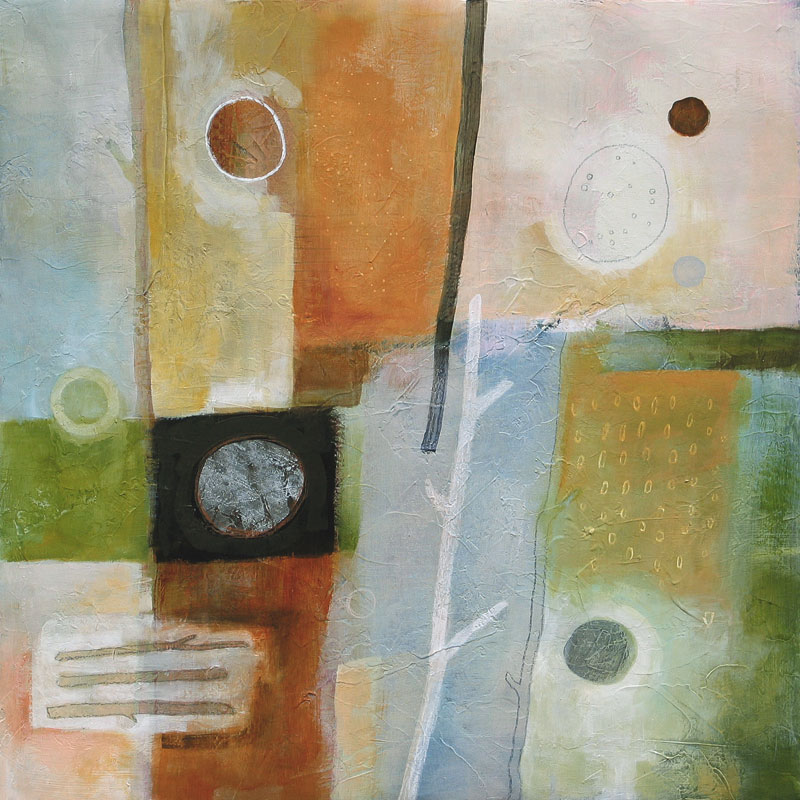
Friday, June 29, 2012
They must really like Reverie
So today on the Artful Home, I thought I would look at what’s new for “Art for the Wall”, which is a higher level page than “Paintings”, which I noted in my last post about Reverie. And much to my surprise, there is little Reverie, in the top row, fourth slot/position! I think it’s interesting that this particular painting has gotten a lot of advantageous positioning on this site and yet… no interest. [sigh].


Click on the image above to see the page
as it appeared today when I clicked on “New Art for the Wall”.
7-2-12 UPDATE: Today I looked on the Artful Home and Reverie was on page 81, four pages after Fall Where They May, which was on page 77. They had their time, but I guess it’s time for them to promote other paintings…
Monday, June 25, 2012
Suzette the incongruous
So yesterday I still had an urge to do a neutral/monotone figurative piece (with a splash of red somewhere). I spent some time prepping a new cradled wood panel but in between sanding and texturing, I decided to work on another figurative piece. I was browsing through a photography source book, when I came across a photo of a woman with this wild spiky hair. My painting is not a copy of the photograph, it is a “remembered” vision of it. I looked at it for a while, did a light outline in crayon on the paper for composition, then did not look at the photograph until I had finished. I have no clue what to call this one (I was even toying with the idea of using “Untitled” for the first time in my painting career!), but on the TV this morning while I was getting ready for work, I heard the name “Suzette” which is such a beautiful name. I know this name doesn’t go with this figure, but somehow her hair and expression don’t go with anything either, everything seems rather incongruous… Anyway, here she is, “Suzette the incongruous”:


Suzette the incongruous
12" x 12", acrylic on paper
Below is the photograph that I saw and painted from “memory”. See! Her hair really was that crazy!!

I think it’s time to get back to those abstracts!
Sunday, June 24, 2012
Opposites, Attractions and the Circle of Inspiration
This weekend, I purchased two new pieces of art for my growing collection of small figurative paintings. I thought I might group them with another piece I bought last month. Of course I have to wait for the new pieces to arrive to really be able to tell if the three will look good together… My plan is to hang them on the very small section of wall just left of the tiny window in my guest bathroom, which is so small, only something the size of these exquisite small works will fit. My guest bathroom is turning into a little art galley! I put them together in Photoshop just to see how they might look and then simulated the wall color, which is a mid-tone muted green:

Anyway, the reason I bring this up is because I was so inspired by browsing through all of the figurative pieces from some of my favorite artists while trying to decide what to spend my June art allowance on, that I had the uncontrollable urge to create a figurative work of my own yesterday, and so I did. I wanted to do a neutral face painting as I was very inspired by these and similar pieces I had been looking at. And of course, I got the last-minute urge to do something colorful and out of my comfort zone. So here is my latest painting, which is very small.


from top to bottom:
Daniel Moreira (Portugal) from “The Human Face” series, 6" x 6"
acrylic, watercolor and pencil on board mounted to balsa wood
“Graceful” by Micki Wilde (England), 8" x 8"
acrylic paint, caran d’ache, charcoal and pen on cradled wood
“The Natural Environment of Man”, 6" x 6" by Angela Petsis (PA)
mixd media on cradled wood panel
Anyway, the reason I bring this up is because I was so inspired by browsing through all of the figurative pieces from some of my favorite artists while trying to decide what to spend my June art allowance on, that I had the uncontrollable urge to create a figurative work of my own yesterday, and so I did. I wanted to do a neutral face painting as I was very inspired by these and similar pieces I had been looking at. And of course, I got the last-minute urge to do something colorful and out of my comfort zone. So here is my latest painting, which is very small.

Colorful, 8" x 8"
acrylic on canvas board
The point of this long-winded post is that this painting would never have been created had I not seen the work of other artists and felt that inspiration. Not that mine is a great painting by any stretch, in fact it’s so far out of my usual color palette I’m not sure how I feel about this one. But it’s mere existence is a tribute to my appreciation of the work of other artists. The “circle” always kind of amazes me.
Saturday, June 23, 2012
Right Turn
…and this is how it turned out, the companion piece I spoke of in my last post. Completely different than where it started! When I was initially working on this, it was in a different color scheme, more like The Voyage. Then I got the idea that I wanted to try a more neutral color palette with splashes of red. This is where that notion took this piece, and I really like it. Sometimes it’s good to just get in there and mess the painting up to set it in the right direction. I must try to remember this on larger pieces because sometimes I get too much of a vested interest in a particular section of a painting, even though it’s not working in it’s entirety. Sometimes you just have to let all that go and trudge fearlessly down a new path.


Right Turn
12" x 12", Acrylic on Paper
Friday, June 22, 2012
Out of the Blue
I didn't get as much painting done as I would have liked this past week. I started two small ones on Monday evening and I really wasn’t “feeling it” for either of them. I even lost a bit of interest in them and feared the dreaded painter’s block. But Wednesday evening I decided to “attack” one of them (mess it up!) and within an hour, this mostly appeared on the paper. I took another look at it last night, added a few touches and decided that I really like this one. It sort of happened “out of the blue”! I started to mess the companion piece up last night, so we’ll see where that one ends up!


Out of the Blue
12" x 12", Acrylic on Paper
Sunday, June 17, 2012
New 12 x 12s
This past week I painted three new small ones on paper. They are not intended to stand together as a grouping. Each represents a separate exploration in terms of materials and color. I think I will be offering them on the Artful Home’s Summer Studio Sale which will begin in a few weeks. But for now, they’ll just reside here on the blog…


Rustica, 12" x 12"

Primarily Speaking, 12" x 12"

The Voyage, 12" x 12"
Tuesday, June 12, 2012
They Must Like Reverie
…the Artful Home, that is. Today when I was browsing their site and clicked on their “Paintings” section, there it was, in first position! I have submitted work subsequently to Reverie, yet they still put it on the first page in the “New” section. Interesting. It is my favorite full-sized painting thus far this year, and I guess AH is feeling it too. So it’s a little baffling that it hasn’t sold…


Click on the image above to see how it looked today
when I clicked on “Paintings”.
How funny, just as I was posting this I noticed that my artist-friend Filomena Booth’s painting entitled Orange Vase is in the top row on the far right. I had just commented on her blog earlier today how I loved the colors of this piece. It’s a really beautiful painting. I didn’t realize until now that it was on the Artful Home!
Monday, June 11, 2012
Dalliance
The latest. With a color palette inspired by “A Touch of Yellow” from last weekend, this piece is larger and on a canvas. I will be submitting it to the Artful Home.


Dalliance
24" x 24", Acrylic on Canvas
Sunday, June 3, 2012
Two New Paintings
This weekend I worked small again, coming up with two that I like. The challenge for me always seems to be making these studies larger on canvas. But more on that later. For now, these little ones each signify a departure from my usual color palette.
For the first one, I used cutout pieces of watercolor paper that I painted randomly and collaged them onto a sheet of canvas-textured paper that I had already prepared a while back. I had been experiencing an urge to utilize collage into painting and this is where it took me. Sort of “Reclamation-ish” but without the lengthy prep work. This is how it turned out.


For the first one, I used cutout pieces of watercolor paper that I painted randomly and collaged them onto a sheet of canvas-textured paper that I had already prepared a while back. I had been experiencing an urge to utilize collage into painting and this is where it took me. Sort of “Reclamation-ish” but without the lengthy prep work. This is how it turned out.

Turn of Events (study)
12" x 12", Acrylic on Paper
The second one was pure color experimentation with a few tubes of paint that just took my fancy. I like how it turned out!

A Touch of Yellow
12" x 12", Acrylic on Paper
Forgotten Sticks and Stones
A while back I did these tiny Sticks and Stones. Small and all on paper, these were to experiment with color and new techniques like tissue paper collage, paint pens, oil wax crayon, scraping and re-cropping. They aren’t going to be for sale, although I think #58 has potential. I have framed that one in a tiny frame but I think I might mount it to a wood support with white-painted edges. I was documenting this morning and since I just photographed them, I thought I would post a quickie on them.


from top to bottom: Sticks & Stones #s 57, 58 and 59
6" x 6", Acrylic on Paper
Friday, June 1, 2012
Sticks & Stones #63
I just submitted this painting to the Artful Home. I finished it after #64, the small work on paper in my previous post, but started this one first, hence its earlier numeric designation. I mention this only because I was pretty sure it was finished before #64. I even photographed it. But when I was doing the color correction to the image, something just wasn’t right. It didn’t seem finished. I left it alone for a couple of days, painted #64 in the interim, then decided I definitely needed to do something with this one. So I did and now I like it so much better.


Sticks & Stones #63
18" x 24", Acrylic on canvas
Thursday, May 31, 2012
A small painting
It was fun to paint. Like magic.

Sticks & Stones #64
9 x 12, Acrylic on Paper
Monday, May 28, 2012
New “Arte”
Finally! Inspired by the small study on paper entitled Arte de Natura, Elemental will be submitted to the Artful Home for consideration. Hopefully, it will be up by the end of the week.

Elemental
24 x 24, Acrylic on Canvas
5-31-12 Update: it is now available on the Artful Home!!
Monday, May 21, 2012
My own art collection
After my post yesterday it got me thinking… perhaps people would be interested to know that I also collect art and have for several years. So I think that from time to time I will talk about my art purchases and show pictures of them hanging in my house. This first piece that I will share is a piece I bought about eight or nine years ago. The artist is Sunstone Maria. At one time, she sold her work on eBay and that is where I purchased this piece. The painting is entitled “Saturday Morning” and it measures 24" square. I remember she listed this piece a few times and to my complete surprise, it did not sell. But every time she relisted it, I would watch it. Then one day, she put it on an extreme sale and it was a “Buy It Now”. At this point, I could not pass it up, so I immediately “bought it then”. It’s always a little bit of a gamble with art on eBay. A lot of the artists (at least then) did not know how to color-balance their painting images and I have to admit that a few times an art piece would arrive and I would be very disappointed as the color was no where near what I was expecting. But this piece arrived and was exactly as it had been depicted. I have been happy with it for the past several years and it hangs in my living room above the fake fireplace. Below is a photo of my living room in its entirety, taken a few years ago. I've added a few things, but the art is still the same.


I recently did a Google search for Sunstone Maria and was pleased to find that she is still creating art and has a website:
http://sunstonemaria.com/

Full view of the living room. Sunstone Maria’s “Saturday Morning” is in the center above the fireplace. The piece on the left is a reproduction (the only reproduction I own) and the three pieces on the right are paintings that I have done.

A closer image of “Saturday Morning”.
I recently did a Google search for Sunstone Maria and was pleased to find that she is still creating art and has a website:
http://sunstonemaria.com/
Sunday, May 20, 2012
Whatever happened to…?
I recently had a conversation with someone about how I love to receive photos from the people who buy my paintings showing how my paintings are framed or displayed. I got the urge to locate those photos and here’s what I’ve found.


Sentinel and Rhyme & Reason (2005) were both purchased by the same person and this is how she had them framed.
Back in 2005, I did a lot of Small Works on Paper. They all measured 9" x 12" and I found the process quite freeing. I think this is where my love of working on paper originated. I approach a piece on paper with an eagerness to try anything (after all, it's only paper!), and usually what happens is something good and I'll think, “I wish I could just transfer that onto a canvas!” These next pieces were all in that series and the same person purchased all three. I love how they look framed.


Small Work #19 (top)
and Small Work #23 with Small Work #24 (bottom)
The customer (an art consulting firm) did not send me the photos below. I found them on their website in a section displaying samples of their corporate installations. These were commissions done in 2008.


Reclamation 28 and Reclamation 29
So, if there is anyone out there reading this who owns a Glenys Porter Original, please send me a photo(s) of how you have it (them) displayed. I would love to see them again!
Friday, May 18, 2012
Linger and Lollop
So this is how they turned out, the pieces on paper that I was working on last weekend. They took an unexpected turn in a completely different direction and ended up looking like this, no bright colors, no blue, no orange. Still, I like how they turned out.

Linger (left) and Lollop (right)
18 x 18, Acrylic on Paper
Progressives of New Work
So now that I am once again inspired to make paintings, I thought it would be interesting to post the progress of a project. Shown below is the beginning of a new set of paintings, inspired by a study I did in my new "messy" style. The piece that inspired this is shown below, entitled "Arte de Natura (a study)". It's a small piece, painted on paper. I enjoyed painting it. It happened kind of magically. I love when that happens.

So the pictures below show the start of the new pieces. The idea is that they coordinate with one another, ideally ultimately hanging together. So I paint them simultaneously. This picture was taken after two painting sessions, each about 30 to 40 minutes each.


Then I changed my mind! I was liking the general direction/color scheme and then I hit a block. I couldn't see where to take these. They were too unfinished to be paintings, but I couldn't tell where they needed to go. I started to worry about creative block again, so I knifed over the whole thing and started over. The next post will show the two and how they ultimately turned out. So different! The new ones look more like "Reverie" and "Fall Where They May" than the "Arte de Natura" study. It's funny how these things take unexpected turns!
Thursday, May 17, 2012
Latest email blast from the Artful Home
Well, I was very excited to see one of my new paintings featured on the Artful Home’s latest email campaign! Below is an image of the blast as it looked in my email program. Click on the picture to see it full-size. Notice how all the art pieces are color-coordinated in this well-designed blast. "Fall Where They May" goes perfectly with the other items depicted!


Check out the Artful Home:
Wednesday, May 16, 2012
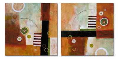
The Latest Sticks & Stones
Immediately after the paintings in my previous post, I did a couple of Sticks & Stones in this new looser style. These did not happen as "magically" as as those in the previous post. They started off in a completely different color scheme. Then I changed my mind. Then I changed my mind again. They finally ended up here, not as planned, and I still wasn't so sure when I finished them. It took a couple of days, but these really grew on me. Now I wouldn't consider a different color palette for these. I absolutely love them. They are works on paper measuring 20 inches square and were originally painted for consideration by the poster company, who showed no interest whatsoever. Not able to sell these on the Artful Home, I have posted them online elsewhere for sale, where to my continued disappointment there continues to be no interest. I have decided that if they do not sell by August, I will take them to the local framer and have them professionally framed for my house. I will hang them in the living room side by side and enjoy them myself! So here they are, the latest in my Sticks & Stones series: #s 60 and 61.


Sunday, May 13, 2012
Long time, no paintings…
Okay, well it's been a while since I've posted. And truth be known, painting dropped off for me shortly after that last post in '08. I can't really explain what happened. I guess I just got caught up in the day-to-day work-friends-life experiences and simply lost touch with the creative painting process. I did a few commissions in '09, painted a couple of small pieces in '10 but I didn't create a single painting in the year 2011! It recently came to my attention that my website didn't have any new work in the "new" section. I decided to update the site and discovered how long it had been!
I missed making paintings. I often wondered what it would take to "get it back". I hoped, even prayed for the turnaround. While I occasionally felt "stirrings", nothing seemed to materialize from them. There were a couple of times when I sat down in front of the easel, wanting to paint but nothing happened. I started to disregard the stirrings. Until this past February…
So things have turned around a bit and I have been painting. It started with some figurative work that I had an urge to do, evolving into a return to the abstracts. And the paintings are a little different. Looser, without my usual hard edges and I'm liking what's happening now. Even my color palette has brightened up considerably. Whereas primary colors used to look so "wrong" on my canvases (please understand I have always loved bright colors, just not in my own paintings), now I think it looks completely wonderful!

 Two of my recent favorites are shown here that I posted on the Artful Home (artfulhome.com). The first is titled "Reverie" and the second is "Fall Where They May".
Ah, it's good to be painting again.
I missed making paintings. I often wondered what it would take to "get it back". I hoped, even prayed for the turnaround. While I occasionally felt "stirrings", nothing seemed to materialize from them. There were a couple of times when I sat down in front of the easel, wanting to paint but nothing happened. I started to disregard the stirrings. Until this past February…
So things have turned around a bit and I have been painting. It started with some figurative work that I had an urge to do, evolving into a return to the abstracts. And the paintings are a little different. Looser, without my usual hard edges and I'm liking what's happening now. Even my color palette has brightened up considerably. Whereas primary colors used to look so "wrong" on my canvases (please understand I have always loved bright colors, just not in my own paintings), now I think it looks completely wonderful!


Ah, it's good to be painting again.
Subscribe to:
Posts (Atom)